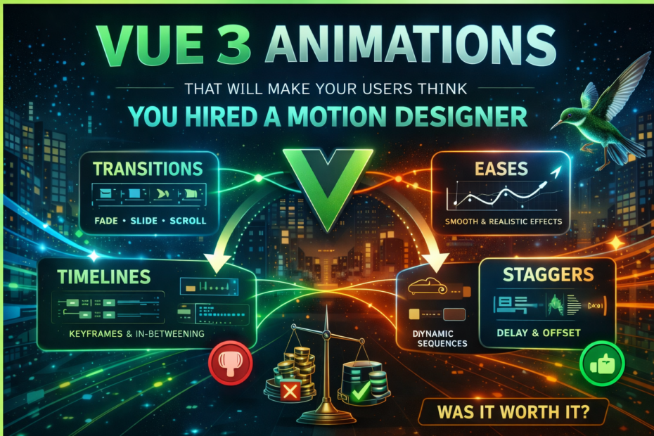
Transition groups, GSAP integration, scroll-triggered animations, shared element transitions with the View Transitions API — the complete guide to building UI animations in Vue 3 that feel expensive without adding complexity.
Most Vue applications have the same animation story: a fade here, a slide there, and then nothing — because implementing anything more sophisticated felt like too much work for a feature that “isn’t really important.” That assumption is wrong. Animations are not decoration. They’re communication. They tell users what changed, where focus should go, and how the interface is responding. Done well, they make an application feel fast and considered. Done poorly or skipped entirely, they make it feel clunky.
Vue 3 has one of the best animation primitives of any UI framework — the <Transition> and <TransitionGroup> components — combined with a clean JavaScript hook API that integrates beautifully with libraries like GSAP. And in 2026, the View Transitions API is now Baseline (shipping in Chrome, Edge, Firefox, and Safari), which means shared element transitions between routes are no longer a Chrome-only feature.
This is the complete guide to all of it.
Understanding Vue’s Transition Class Lifecycle
Before touching any library, understanding Vue’s built-in transition class system is essential — because it underlies every animation pattern in this post.
When an element enters or leaves the DOM through v-if or v-show inside a <Transition> component, Vue applies a series of CSS classes at precise moments:
Enter:
  v-enter-from  →  v-enter-active  →  v-enter-to
  (start state)    (duration/ease)    (end state)

Leave:
  v-leave-from  →  v-leave-active  →  v-leave-to
  (start state)    (duration/ease)    (end state)
Replaced with your transition’s name prop:
<Transition name="slide-up">
  <div v-if="show">Content</div>
</Transition>

<style>
/* Starting state — element is here but invisible */
.slide-up-enter-from,
.slide-up-leave-to {
  opacity: 0;
  transform: translateY(20px);
}

/* Active state — defines duration and easing */
.slide-up-enter-active,
.slide-up-leave-active {
  transition: opacity 0.3s ease, transform 0.3s ease;
}

/* End state — element is visible in position */
.slide-up-enter-to,
.slide-up-leave-from {
  opacity: 1;
  transform: translateY(0);
}
</style>
The <Transition> Component: Getting the Details Right
The appear Prop — Animate on Initial Render
By default, <Transition> only animates when state changes. Adding :appear="true" triggers the enter animation when the component first mounts — useful for page-load effects.
<Transition name="fade" appear>
  <HeroSection />
</Transition>
mode=”out-in” — The Most Important Option Most People Miss
Without a mode, when switching between two elements both animate simultaneously — the outgoing element leaves while the incoming one enters. This almost always looks wrong. mode="out-in" waits for the leave animation to finish before starting the enter animation.
<!-- ✗ Both animate at the same time — looks broken -->
<Transition name="fade">
  <ComponentA v-if="isA" />
  <ComponentB v-else />
</Transition>

<!-- ✓ Leave completes, then enter begins -->
<Transition name="fade" mode="out-in">
  <ComponentA v-if="isA" :key="'a'" />
  <ComponentB v-else :key="'b'" />
</Transition>
Directional Slide Transitions
A common pattern for tab-like navigation: slide left when advancing, slide right when going back.
<script setup lang="ts">
import { ref, computed } from 'vue'

const currentIndex = ref(0)
const direction    = ref<'forward' | 'back'>('forward')

function navigate(index: number) {
  direction.value = index > currentIndex.value ? 'forward' : 'back'
  currentIndex.value = index
}

const transitionName = computed(() =>
  direction.value === 'forward' ? 'slide-forward' : 'slide-back'
)
</script>

<template>
  <Transition :name="transitionName" mode="out-in">
    <KeepAlive>
      <component :is="steps[currentIndex]" :key="currentIndex" />
    </KeepAlive>
  </Transition>
</template>

<style>
/* Forward: current slides left, next slides in from right */
.slide-forward-enter-from  { transform: translateX(100%); opacity: 0; }
.slide-forward-leave-to    { transform: translateX(-100%); opacity: 0; }
.slide-forward-enter-active,
.slide-forward-leave-active { transition: transform 0.3s ease, opacity 0.3s ease; }

/* Back: current slides right, previous slides in from left */
.slide-back-enter-from  { transform: translateX(-100%); opacity: 0; }
.slide-back-leave-to    { transform: translateX(100%); opacity: 0; }
.slide-back-enter-active,
.slide-back-leave-active { transition: transform 0.3s ease, opacity 0.3s ease; }
</style>
Reusable Transition Components
Wrapping <Transition> in a component makes it reusable across the application and keeps transition logic in one place.
<!-- components/FadeTransition.vue -->
<template>
  <Transition
    name="fade"
    mode="out-in"
    v-bind="$attrs"
  >
    <slot />
  </Transition>
</template>

<style>
/* Note: no scoped — must apply to slot content */
.fade-enter-from,
.fade-leave-to   { opacity: 0; }
.fade-enter-active,
.fade-leave-active { transition: opacity 0.25s ease; }
</style>
<!-- Use it anywhere -->
<FadeTransition>
  <UserCard v-if="user" :key="user.id" />
</FadeTransition>
<TransitionGroup>: Animating Lists
<TransitionGroup> animates items entering, leaving, and moving within a list. It renders a wrapping element (<ul>, <div>, etc.) by default — set tag="ul" or use tag="" to skip the wrapper.
The v-move Magic
The most impressive feature of <TransitionGroup> is automatic position animation. When items in a list reorder, Vue detects the position change and applies a smooth transform. The only CSS required is the -move class with a transition.
<script setup lang="ts">
import { ref } from 'vue'

const items = ref([
  { id: 1, name: 'Design system' },
  { id: 2, name: 'API integration' },
  { id: 3, name: 'User testing' },
  { id: 4, name: 'Performance audit' },
])

function shuffle() {
  items.value = [...items.value].sort(() => Math.random() - 0.5)
}

function removeItem(id: number) {
  items.value = items.value.filter(item => item.id !== id)
}
</script>

<template>
  <button @click="shuffle">Shuffle</button>

  <TransitionGroup name="list" tag="ul" class="item-list">
    <li v-for="item in items" :key="item.id">
      {{ item.name }}
      <button @click="removeItem(item.id)">×</button>
    </li>
  </TransitionGroup>
</template>

<style>
/* Enter/leave animations */
.list-enter-from,
.list-leave-to {
  opacity: 0;
  transform: translateX(-30px);
}
.list-enter-active,
.list-leave-active {
  transition: opacity 0.4s ease, transform 0.4s ease;
}

/* This is the magic — items reposition smoothly when others enter/leave */
.list-move {
  transition: transform 0.4s ease;
}

/* Leaving items must be taken out of flow for move to work */
.list-leave-active {
  position: absolute;
}
</style>
Staggered List Entrance
For staggered entry animations, use JavaScript hooks with data-index to offset each item’s delay:
<script setup lang="ts">
import { ref } from 'vue'

const cards = ref([
  { id: 1, title: 'Revenue', value: '$124,500' },
  { id: 2, title: 'Users',   value: '8,420' },
  { id: 3, title: 'Churn',   value: '2.1%' },
])

function beforeEnter(el: HTMLElement) {
  el.style.opacity = '0'
  el.style.transform = 'translateY(20px)'
}

function enter(el: HTMLElement, done: () => void) {
  const index = Number(el.dataset.index)
  el.style.transition = `opacity 0.4s ease ${index * 80}ms, transform 0.4s ease ${index * 80}ms`
  // Force reflow so the transition picks up the initial state
  el.offsetHeight
  el.style.opacity = '1'
  el.style.transform = 'translateY(0)'
  el.addEventListener('transitionend', done, { once: true })
}
</script>

<template>
  <TransitionGroup tag="div" :css="false" @before-enter="beforeEnter" @enter="enter">
    <StatCard
      v-for="(card, index) in cards"
      :key="card.id"
      :data-index="index"
      :card="card"
    />
  </TransitionGroup>
</template>
GSAP Integration: Beyond CSS Transitions
CSS transitions are excellent for simple enter/leave effects. GSAP unlocks everything else: complex sequenced animations, spring physics, SVG morphing, timeline scrubbing, and precise control over easing curves.
Installation
npm install gsap
Basic GSAP + Transition Hook Pattern
<script setup lang="ts">
import { ref } from 'vue'
import gsap from 'gsap'

const show = ref(false)

function onEnter(el: HTMLElement, done: () => void) {
  gsap.fromTo(el,
    { opacity: 0, y: 30, scale: 0.95 },
    {
      opacity: 1,
      y: 0,
      scale: 1,
      duration: 0.5,
      ease: 'power3.out',
      onComplete: done,
    }
  )
}

function onLeave(el: HTMLElement, done: () => void) {
  gsap.to(el, {
    opacity: 0,
    y: -20,
    scale: 0.95,
    duration: 0.35,
    ease: 'power2.in',
    onComplete: done,
  })
}
</script>

<template>
  <!-- :css="false" tells Vue not to apply transition classes — GSAP handles everything -->
  <Transition :css="false" @enter="onEnter" @leave="onLeave">
    <div v-if="show" class="modal">
      <slot />
    </div>
  </Transition>
</template>
GSAP Timeline for Sequenced Modal Animation
Modals are the perfect use case for GSAP timelines — animate the backdrop, then the container, then the content in sequence.
<script setup lang="ts">
import { ref } from 'vue'
import gsap from 'gsap'

const show = ref(false)

function onEnter(el: HTMLElement, done: () => void) {
  const backdrop = el.querySelector('.modal-backdrop') as HTMLElement
  const container = el.querySelector('.modal-container') as HTMLElement
  const title     = el.querySelector('.modal-title') as HTMLElement
  const body      = el.querySelector('.modal-body') as HTMLElement
  const actions   = el.querySelector('.modal-actions') as HTMLElement

  const tl = gsap.timeline({ onComplete: done })

  tl.fromTo(backdrop,
    { opacity: 0 },
    { opacity: 1, duration: 0.2, ease: 'none' }
  )
  .fromTo(container,
    { opacity: 0, y: 40, scale: 0.96 },
    { opacity: 1, y: 0, scale: 1, duration: 0.35, ease: 'back.out(1.4)' },
    '-=0.1'  // overlap with backdrop animation
  )
  .fromTo([title, body, actions],
    { opacity: 0, y: 12 },
    { opacity: 1, y: 0, duration: 0.3, stagger: 0.06, ease: 'power2.out' },
    '-=0.15'
  )
}

function onLeave(el: HTMLElement, done: () => void) {
  gsap.to(el, {
    opacity: 0,
    scale: 0.97,
    duration: 0.2,
    ease: 'power2.in',
    onComplete: done,
  })
}
</script>
GSAP with TransitionGroup — Staggered List with Spring
<script setup lang="ts">
import gsap from 'gsap'

function beforeEnter(el: HTMLElement) {
  el.style.opacity = '0'
  el.style.transform = 'translateY(30px)'
}

function onEnter(el: HTMLElement, done: () => void) {
  const index = Number(el.dataset.index)

  gsap.to(el, {
    opacity: 1,
    y: 0,
    duration: 0.5,
    delay: index * 0.07,
    ease: 'back.out(1.2)',
    onComplete: done,
  })
}

function onLeave(el: HTMLElement, done: () => void) {
  const index = Number(el.dataset.index)

  gsap.to(el, {
    opacity: 0,
    x: 40,
    duration: 0.3,
    delay: index * 0.04,
    ease: 'power2.in',
    onComplete: done,
  })
}
</script>

<template>
  <TransitionGroup
    :css="false"
    @before-enter="beforeEnter"
    @enter="onEnter"
    @leave="onLeave"
    tag="ul"
  >
    <li
      v-for="(item, index) in items"
      :key="item.id"
      :data-index="index"
    >
      {{ item.name }}
    </li>
  </TransitionGroup>
</template>
Motion Vue: The Ergonomic Alternative to GSAP
If GSAP feels like too much setup, Motion Vue (the official Vue port of Motion, previously Framer Motion) provides a declarative animation API with first-class Vue support.
npm install motion
<script setup lang="ts">
import { Motion } from 'motion/vue'
</script>

<template>
  <!-- Animate on mount -->
  <Motion
    :initial="{ opacity: 0, y: 20 }"
    :animate="{ opacity: 1, y: 0 }"
    :transition="{ duration: 0.4, ease: 'easeOut' }"
  >
    <div class="card">Hello!</div>
  </Motion>

  <!-- Animate on hover and press — gesture-aware (no false hover on touch) -->
  <Motion
    :whileHover="{ scale: 1.05, y: -4 }"
    :whilePress="{ scale: 0.97 }"
    :transition="{ type: 'spring', stiffness: 400, damping: 17 }"
    tag="button"
  >
    Click me
  </Motion>
</template>
Scroll-Triggered Animations
Pattern 1: IntersectionObserver + CSS Classes (Lightweight)
The lightest approach — no library, uses the browser’s IntersectionObserver API directly via a Vue composable.
// composables/useScrollReveal.ts
import { ref, onMounted, onUnmounted, type Ref } from 'vue'

interface ScrollRevealOptions {
  threshold?: number
  rootMargin?: string
  once?:       boolean
}

export function useScrollReveal(
  target:  Ref<HTMLElement | null>,
  options: ScrollRevealOptions = {}
) {
  const { threshold = 0.15, rootMargin = '0px', once = true } = options
  const isVisible = ref(false)
  let observer: IntersectionObserver | null = null

  onMounted(() => {
    if (!target.value) return

    observer = new IntersectionObserver(
      ([entry]) => {
        if (entry.isIntersecting) {
          isVisible.value = true
          if (once) observer?.disconnect()
        } else if (!once) {
          isVisible.value = false
        }
      },
      { threshold, rootMargin }
    )

    observer.observe(target.value)
  })

  onUnmounted(() => observer?.disconnect())

  return { isVisible }
}
<!-- RevealOnScroll.vue — reusable wrapper component -->
<script setup lang="ts">
import { ref } from 'vue'
import { useScrollReveal } from '@/composables/useScrollReveal'

withDefaults(defineProps<{
  delay?:     number
  direction?: 'up' | 'down' | 'left' | 'right'
  distance?:  number
}>(), {
  delay:     0,
  direction: 'up',
  distance:  30,
})

const el = ref<HTMLElement | null>(null)
const { isVisible } = useScrollReveal(el, { threshold: 0.15, once: true })
</script>

<template>
  <div
    ref="el"
    :style="{
      transitionDelay: `${delay}ms`,
      transform: isVisible ? 'none' : getInitialTransform(direction, distance),
      opacity: isVisible ? 1 : 0,
      transition: 'opacity 0.6s ease, transform 0.6s ease',
    }"
  >
    <slot />
  </div>
</template>
<!-- Usage — staggered feature cards -->
<template>
  <section class="features">
    <RevealOnScroll v-for="(feature, i) in features" :key="feature.id" :delay="i * 100">
      <FeatureCard :feature="feature" />
    </RevealOnScroll>
  </section>
</template>
Pattern 2: GSAP ScrollTrigger
For scroll-linked animations — where the animation position is directly tied to scroll progress — GSAP’s ScrollTrigger plugin is the standard tool.
npm install gsap
<script setup lang="ts">
import { ref, onMounted, onUnmounted } from 'vue'
import gsap from 'gsap'
import { ScrollTrigger } from 'gsap/ScrollTrigger'

gsap.registerPlugin(ScrollTrigger)

const sectionRef = ref<HTMLElement | null>(null)
const headingRef = ref<HTMLElement | null>(null)
const cardsRef   = ref<HTMLElement | null>(null)

onMounted(() => {
  if (!sectionRef.value) return

  // Heading animates in when the section enters the viewport
  gsap.fromTo(headingRef.value,
    { opacity: 0, y: 50 },
    {
      opacity: 1,
      y: 0,
      duration: 0.8,
      ease: 'power3.out',
      scrollTrigger: {
        trigger: sectionRef.value,
        start:   'top 80%',
        end:     'top 40%',
        scrub:   false,  // snap to final state on enter
      }
    }
  )

  // Cards stagger in one by one as the section scrolls into view
  const cards = cardsRef.value?.querySelectorAll('.card') ?? []
  gsap.fromTo(cards,
    { opacity: 0, y: 40 },
    {
      opacity: 1,
      y: 0,
      duration: 0.6,
      stagger: 0.1,
      ease: 'power2.out',
      scrollTrigger: {
        trigger: cardsRef.value,
        start:   'top 75%',
      }
    }
  )
})

onUnmounted(() => {
  // Clean up ScrollTrigger instances when component unmounts
  ScrollTrigger.getAll().forEach(t => t.kill())
})
</script>

<template>
  <section ref="sectionRef" class="feature-section">
    <h2 ref="headingRef">Features</h2>
    <div ref="cardsRef" class="cards-grid">
      <div v-for="feature in features" :key="feature.id" class="card">
        {{ feature.title }}
      </div>
    </div>
  </section>
</template>
Pattern 3: Scroll-Linked Progress Bar
A reading progress indicator — a common pattern that ties directly to scroll position.
<script setup lang="ts">
import { ref, onMounted, onUnmounted } from 'vue'

const progress = ref(0)

function updateProgress() {
  const scrollTop    = window.scrollY
  const docHeight    = document.documentElement.scrollHeight - window.innerHeight
  progress.value     = docHeight > 0 ? (scrollTop / docHeight) * 100 : 0
}

onMounted(() => window.addEventListener('scroll', updateProgress, { passive: true }))
onUnmounted(() => window.removeEventListener('scroll', updateProgress))
</script>

<template>
  <div class="progress-bar" :style="{ width: `${progress}%` }" />
</template>

<style scoped>
.progress-bar {
  position: fixed;
  top: 0;
  left: 0;
  height: 3px;
  background: linear-gradient(90deg, #6366f1, #8b5cf6);
  z-index: 1000;
  transition: width 0.1s linear;
}
</style>
The View Transitions API: Shared Element Transitions Between Routes
The View Transitions API is now Baseline — same-document transitions work in Chrome 111+, Edge 111+, Firefox 133+, and Safari 18+, reaching Baseline Newly Available status in October 2025. This is a major development: it means shared element transitions (where an element from one page visually morphs into an element on the next page) now work across all modern browsers without a polyfill.
The Core Concept
// Without View Transitions — instant DOM update
function updateUI() {
  showNewContent()
}

// With View Transitions — browser captures old state,
// updates DOM, then animates between the two snapshots
document.startViewTransition(() => {
  showNewContent()
})
By default you get a cross-fade. With view-transition-name, specific elements get their own independent animations.
Integrating with Vue Router
// router/index.ts
import { createRouter, createWebHistory } from 'vue-router'

const router = createRouter({
  history: createWebHistory(),
  routes,
})

// Wrap every navigation in a View Transition
router.beforeResolve((to, from) => {
  if (
    document.startViewTransition &&
    to.name !== from.name
  ) {
    return new Promise((resolve) => {
      document.startViewTransition(resolve)
    })
  }
})

export default router
/* Global styles — default cross-fade for all routes */
::view-transition-old(root),
::view-transition-new(root) {
  animation-duration: 0.25s;
  animation-timing-function: ease;
}

/* Slide forward for route advances */
.slide-forward::view-transition-old(root) {
  animation: slide-out-left 0.3s ease forwards;
}
.slide-forward::view-transition-new(root) {
  animation: slide-in-right 0.3s ease forwards;
}

@keyframes slide-out-left  { to   { transform: translateX(-100%); } }
@keyframes slide-in-right  { from { transform: translateX(100%);  } }
Shared Element Transitions — The Real Magic
view-transition-name connects a specific element across page navigations. The browser captures the element’s position and size on the old page and animates it to its position on the new page — creating the “shared element” effect.
<!-- ProductCard.vue — in the product list -->
<template>
  <RouterLink :to="`/products/${product.id}`">
    <img
      :src="product.image"
      :alt="product.name"
      :style="{ viewTransitionName: `product-image-${product.id}` }"
    />
    <h3>{{ product.name }}</h3>
  </RouterLink>
</template>
<!-- ProductDetail.vue — the destination page -->
<template>
  <div class="product-detail">
    <img
      :src="product.image"
      :alt="product.name"
      :style="{ viewTransitionName: `product-image-${product.id}` }"
    />
    <h1>{{ product.name }}</h1>
    <p>{{ product.description }}</p>
  </div>
</template>
When the user clicks a product card, the product image smoothly animates from its position in the grid to its position in the detail view — with no animation code in your components. The browser handles it entirely based on the matching view-transition-name.
A useViewTransition Composable
// composables/useViewTransition.ts
export function useViewTransition() {
  function startTransition(callback: () => void | Promise<void>) {
    if (!document.startViewTransition) {
      // Fallback for unsupported browsers — just run the callback
      callback()
      return
    }

    return document.startViewTransition(callback)
  }

  function withTransitionName(name: string) {
    return { style: { viewTransitionName: name } }
  }

  return { startTransition, withTransitionName }
}
<script setup lang="ts">
import { useViewTransition } from '@/composables/useViewTransition'

const { startTransition, withTransitionName } = useViewTransition()

function openDetail(item) {
  startTransition(() => {
    selectedItem.value = item
  })
}
</script>

<template>
  <img
    :src="item.thumbnail"
    v-bind="withTransitionName(`item-${item.id}`)"
    @click="openDetail(item)"
  />
</template>
Customising View Transition Animations
/* Override the default cross-fade for specific named transitions */
::view-transition-group(product-image-*) {
  animation-duration: 0.4s;
  animation-timing-function: cubic-bezier(0.2, 0, 0, 1);
}

/* Only animate position/size — not the cross-fade */
::view-transition-image-pair(product-image-*) {
  isolation: auto;
}

::view-transition-old(product-image-*),
::view-transition-new(product-image-*) {
  animation: none;
  mix-blend-mode: normal;
}
Respecting prefers-reduced-motion
Always wrap animations in a reduced-motion check. Some users have vestibular disorders or simply prefer minimal motion — animations that look great for most users can cause genuine discomfort for others.
/* Disable all view transitions for users who prefer reduced motion */
@media (prefers-reduced-motion: reduce) {
  ::view-transition-group(*),
  ::view-transition-old(*),
  ::view-transition-new(*) {
    animation: none !important;
  }
}
// Composable that respects prefers-reduced-motion
export function useViewTransition() {
  const prefersReducedMotion = window.matchMedia('(prefers-reduced-motion: reduce)').matches

  function startTransition(callback: () => void | Promise<void>) {
    if (!document.startViewTransition || prefersReducedMotion) {
      callback()
      return
    }
    return document.startViewTransition(callback)
  }

  return { startTransition }
}
Page Transition Animations with Vue Router
For full-page transitions using Vue’s built-in <Transition> component rather than the View Transitions API:
<!-- App.vue -->
<script setup lang="ts">
import { ref, watch } from 'vue'
import { useRoute } from 'vue-router'

const route      = useRoute()
const transition = ref('fade')

watch(() => route.meta.transition, (newTransition) => {
  transition.value = (newTransition as string) ?? 'fade'
})
</script>

<template>
  <RouterView v-slot="{ Component, route }">
    <Transition :name="route.meta.transition ?? 'fade'" mode="out-in">
      <component :is="Component" :key="route.path" />
    </Transition>
  </RouterView>
</template>

<style>
/* Fade — default */
.fade-enter-from, .fade-leave-to { opacity: 0; }
.fade-enter-active, .fade-leave-active { transition: opacity 0.25s ease; }

/* Slide up — for modal-like pages */
.slide-up-enter-from { opacity: 0; transform: translateY(40px); }
.slide-up-leave-to   { opacity: 0; transform: translateY(-20px); }
.slide-up-enter-active, .slide-up-leave-active {
  transition: opacity 0.35s ease, transform 0.35s ease;
}
</style>
// router/index.ts — set transition per route via meta
const routes = [
  {
    path: '/',
    component: HomePage,
    meta: { transition: 'fade' },
  },
  {
    path: '/product/:id',
    component: ProductDetail,
    meta: { transition: 'slide-up' },
  },
]
Performance: The Rules That Keep Animations Smooth
Animate Only transform and opacity
These are the only CSS properties that can be animated without triggering layout or paint. Every other property — width, height, top, left, margin, padding — causes the browser to recalculate layout for every frame.
/* ✗ Triggers layout recalculation — janky */
.card-enter-active { transition: height 0.3s ease; }

/* ✓ GPU-accelerated — silky smooth */
.card-enter-active { transition: transform 0.3s ease, opacity 0.3s ease; }
.card-enter-from   { transform: scaleY(0); transform-origin: top; }
will-change — Use Sparingly
will-change: transform hints to the browser that an element will be animated, allowing it to create a compositor layer in advance. Use it only on elements you know will animate imminently — applying it to everything wastes GPU memory.
/* Apply before animation, remove after */
.preparing-to-animate { will-change: transform, opacity; }
// In Vue — set will-change dynamically
function prepareAnimation(el: HTMLElement) {
  el.style.willChange = 'transform, opacity'
}

function cleanupAfterAnimation(el: HTMLElement) {
  el.style.willChange = 'auto'  // release the compositor layer
}
Avoid Animating Too Many Elements Simultaneously
Simultaneously animating 50 cards with independent GSAP instances can overwhelm the main thread. Use stagger in GSAP timelines to sequence them, or reduce the number of animated elements visible at any given time.
A Complete Animation System
Here is a composable that brings the patterns together into a reusable system:
// composables/useAnimation.ts
import { ref, onUnmounted } from 'vue'
import gsap from 'gsap'
import { ScrollTrigger } from 'gsap/ScrollTrigger'

gsap.registerPlugin(ScrollTrigger)

export function useAnimation() {
  const triggers: ScrollTrigger[] = []

  function fadeUp(el: HTMLElement | string, options = {}) {
    return gsap.fromTo(el,
      { opacity: 0, y: 30 },
      { opacity: 1, y: 0, duration: 0.6, ease: 'power3.out', ...options }
    )
  }

  function staggerIn(els: HTMLElement[] | string, options = {}) {
    return gsap.fromTo(els,
      { opacity: 0, y: 20 },
      { opacity: 1, y: 0, duration: 0.5, stagger: 0.08, ease: 'power2.out', ...options }
    )
  }

  function scrollReveal(trigger: HTMLElement, animation: () => gsap.core.Tween) {
    const tween = animation()
    tween.pause()

    const st = ScrollTrigger.create({
      trigger,
      start: 'top 80%',
      onEnter: () => tween.play(),
    })

    triggers.push(st)
    return st
  }

  onUnmounted(() => {
    triggers.forEach(t => t.kill())
  })

  return { fadeUp, staggerIn, scrollReveal }
}
Final Thoughts
Animations in Vue 3 exist on a spectrum from “one CSS class” to “full GSAP timeline” — and most UI requirements sit comfortably in the middle. The built-in <Transition> and <TransitionGroup> components cover the majority of use cases cleanly. GSAP’s JavaScript hooks unlock anything more complex. The View Transitions API now handles shared element transitions natively across all modern browsers, making previously complex patterns accessible with three lines of CSS.
The discipline that makes the difference: always animate transform and opacity, respect prefers-reduced-motion, and keep animation logic in composables where it’s reusable and testable.
Animations are not the opposite of performance. A well-implemented CSS transition that runs on the compositor thread costs nothing in main thread time. What costs something is doing it wrong — animating the wrong properties, creating too many GSAP instances, forgetting cleanup. The patterns in this post avoid all of those mistakes.
Build these into your component library once. Every component you build after that inherits polished motion for free.